Hey, I'm Jason Toon and I know it doesn't matter what color packaging my toiletries come in. Yet my shelf in the shower always seems to wind up with a palette that might bum out a goth. What's up with that? That's what we're talking about in this Shoddy Goods, the newsletter from Meh about the stuff people make, buy, and sell. Once upon a time, soap was soap. Then it got complicated. No category of consumables is more specialized than grooming and personal care, and no section of the supermarket is more obviously gendered. Squint and you can still tell what you're looking at just by color: dark blacks, blues, greys, and greens for men's stuff, lighter and brighter shades for women's. It wasn't always like this. We can trace the growing visible polarization of grooming products by looking at the evolution of one of the first such products to be mass-marketed specifically at men: Speed Stick.
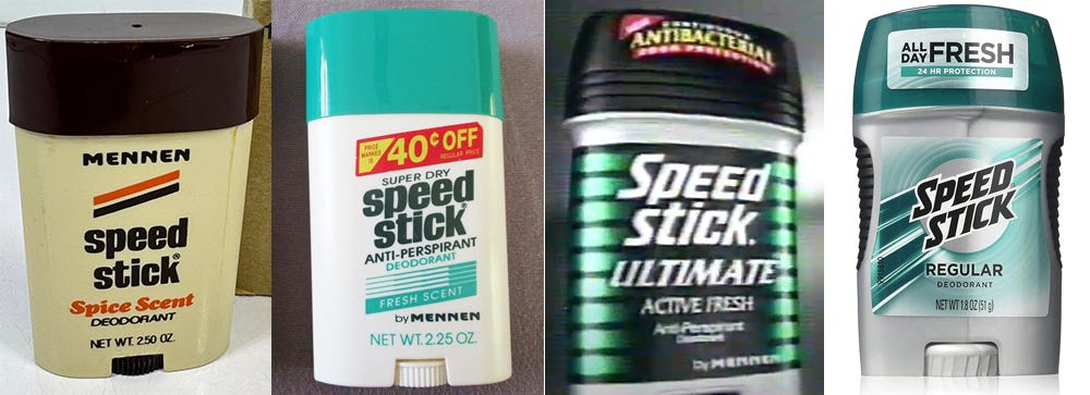
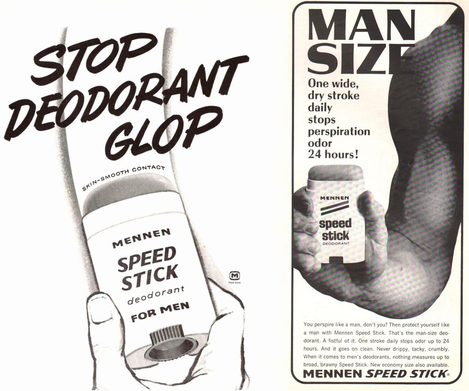
A man's deodorant for men There was never any doubt who Speed Stick was for. From the time the deodorant hit the market in 1962, it telegraphed that it was FOR MEN right there on the package. Its square-jawed typefaces underlined the point, as did the name of the manufacturer, Mennen. That part was an accident - Gerhard Mennen had founded the company in 1878 - but it didn't hurt. Within a few years, the package was accented with racing stripes.
While the earliest deodorants were pitched as quasi-medicinal products, the market later went mainstream in a big way. Between 1942 and 1957, annual U.S. sales increased sixfold to $70 million, and some 50 percent of men used deodorant. Explosive growth, to be sure - but that meant there was still another half of the male population who didn't use it.
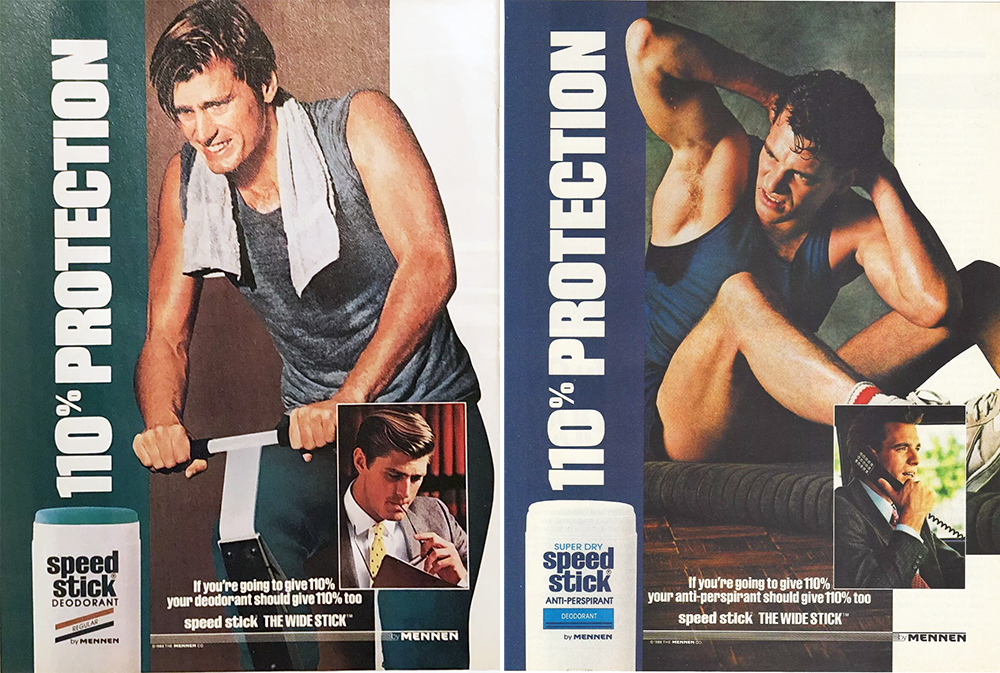
The turn of the '80s saw a brief swerve toward a non-gendered marketing strategy, with more neutral packaging colors and (gasp!) women in the ads. But by mid-decade Mennen steered Speed Stick back toward dudes and spun off Lady Speed Stick for the chicks. These, of course, were also the years of the iconic "by Mennen" jingle, the three-note earworm so irresistible and ubiquitous Seinfeld built a whole plotline around it. It won't be the last thing I think of on my deathbed, but if I linger there long enough, it'll pop up at some point.
A quarter-century after Speed Stick's debut, its package design really hadn't changed much. An active, hard-edged sans-serif font on a white background with some graphic accents that evoked the motion in its name: that was Speed Stick through the '60s, '70s, and '80s. The age of extreme But not the '90s. The first changes were just finer levels of graphic detail, partially down to advances in printing and packaging. But these early '90s package designs are a few decibels louder, fussier, less "cool" and more "hot".
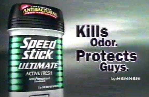
Mennen was bought by Colgate-Palmolive in 1992. By then the industry was figuring out that the best way to get teenage boys to keep themselves clean was to make it seem like mission from a video game or action movie. (Hey, whatever it takes.) Only the wordmark retained a trace of the older, more grown-up Speed Stick aesthetic in the unrecognizable "extreme" packaging of the late '90s. Note also the more aggro language and the focus on "guys". This was deodorant for the first-person-shooter generation.
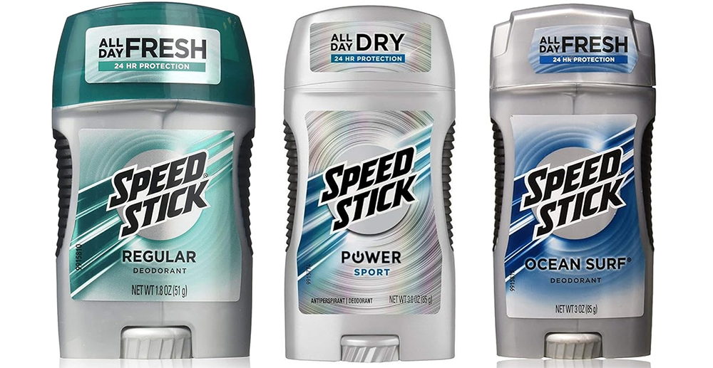
Since then, someone seems to have realized that it doesn't make sense for Speed Stick to look like every other men's toiletry product of the body spray era. So now their somewhat less brooding silver package tries to incorporate a new take on the racing stripes. (That makes sense since Speed Stick finally took the logical move of sponsoring a NASCAR team in 2014.) This is how they glide these days:
OK, so they pulled back a little from the brink. At least they're not black. But these packages still make their '70s and '80s predecessors look downright elegant. Why are glints and gleams and gradients and gratuitous textures supposed to say "manly"? Beats me, but you just don't see these design elements on women's products. Also, the grips on the sides are giving commando cosplay. Were Speed Stick users really having trouble holding onto their deodorant? Like so many other products for men nowadays, it feels like it's trying really hard to convince you it's cool and tough. And that's one thing that midcentury male archetypes from John Wayne to Steve McQueen never seemed to do. Me and the boys cracking open a fresh one As Speed Stick's branding was hitting the steroids, here are a few things that were going on in American society:
Speed Stick was born into a society where a man's role was clear: the breadwinner of his family, the one who ventures forth "in the arena; whose face is marred by dust and sweat and blood; who strives valiantly," as the hairy-chested Theodore Roosevelt quote puts it. The man of 1963 didn't need his deodorant to remind him that he was a man. Society confirmed it for 40 hours every week, whether on the factory floor or in the boardroom. Now, as men's lives are defined less by our jobs, masculine identity is more and more about consumer and cultural choices that broadcast maleness - sometimes in an exaggerated form. You can't control whether the global economy needs you to work in a factory, but you can choose to wear camo and "tactical" gear. You might split the housework 50/50 with your wife, but you don't have to listen to the same podcasts. You probably work with women who do the same jobs you do, but you can decide not to drive the same vehicles, watch the same sports, or use the same deodorant.
As the realities of men's lives have opened up and gotten more varied, the consumer signifiers of manliness have gotten narrower. Speed Stick's evolution is just one window into how people express identity through consumer choices, especially in a hotly contested moment like right now. The men's grooming aisle will probably stay dark for a while yet. But my guess is that as us guys come to terms - sometimes kicking and screaming - with the much wider possibilities of what being a man can mean, our egos will need less reassurance from our deodorant. Maybe soap can even go back to just being soap. It’s funny to see the design differences in the Men’s vs Women’s branding of products. I also love finding the weirdest things that seem like they suddenly need to be gendered for no clear reason. My favorite is the chocolate-covered bread sticks called Pocky - I don’t have any idea what is different about Men’s Pocky than…Pocky. But there it is. Have you seen any ridiculously ‘masculine’ or ‘feminine’ designs or products? Let us know in this week’s Shoddy Goods chat! These past Shoddy Goods stories won't make you smell better, but they also won't stain your shirt:
|